The relentless pace of the modern world, dominated by endless notifications and a persistent digital cacophony, has driven a universal need for restraint and reflection. We are collectively yearning for a moment of quiet, a pause to recalibrate our mission in a world that never stops moving.
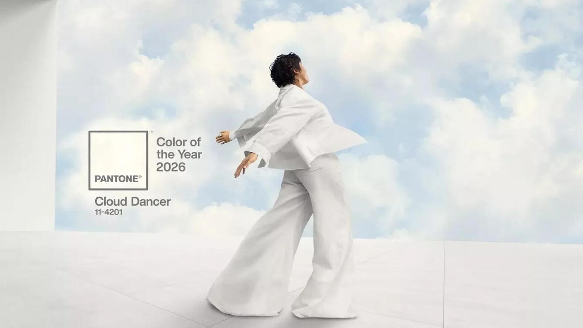
This collective search for tranquility is why the unveiling of PANTONE 11-4201 Cloud Dancer feels so profoundly necessary. This is not just a shade, it is a mindset. A lofty, billowy white, Cloud Dancer serves as a deliberate symbol of tranquility and peace, offering a promise of clarity in a time of transformation.
Cloud Dancer represents the ultimate blank canvas. It signifies the desire for a true fresh start, making a conscious statement of simplification. It enhances our focus, providing the necessary release from the distraction of external influences so we can hear our inner selves and define our boldest missions.
Why We Need Cloud Dancer Now
At its core, Cloud Dancer speaks to the need to step back before leaping forward. It recognizes that true growth is often preceded by quiet focus.
The color embodies the crucial practice of simplification. It acts as a purposeful anchor that compels us to remove friction and distraction. By opening the door to new approaches and peeling away the layers of outmoded thinking, Cloud Dancer allows creativity to breathe. This pause is where bold ideas truly emerge and take shape. For organizations and designers alike, this strategic simplification isn’t just aesthetic; it’s the prerequisite for effective, impactful innovation.
The Psychology of Calm in Experience Design
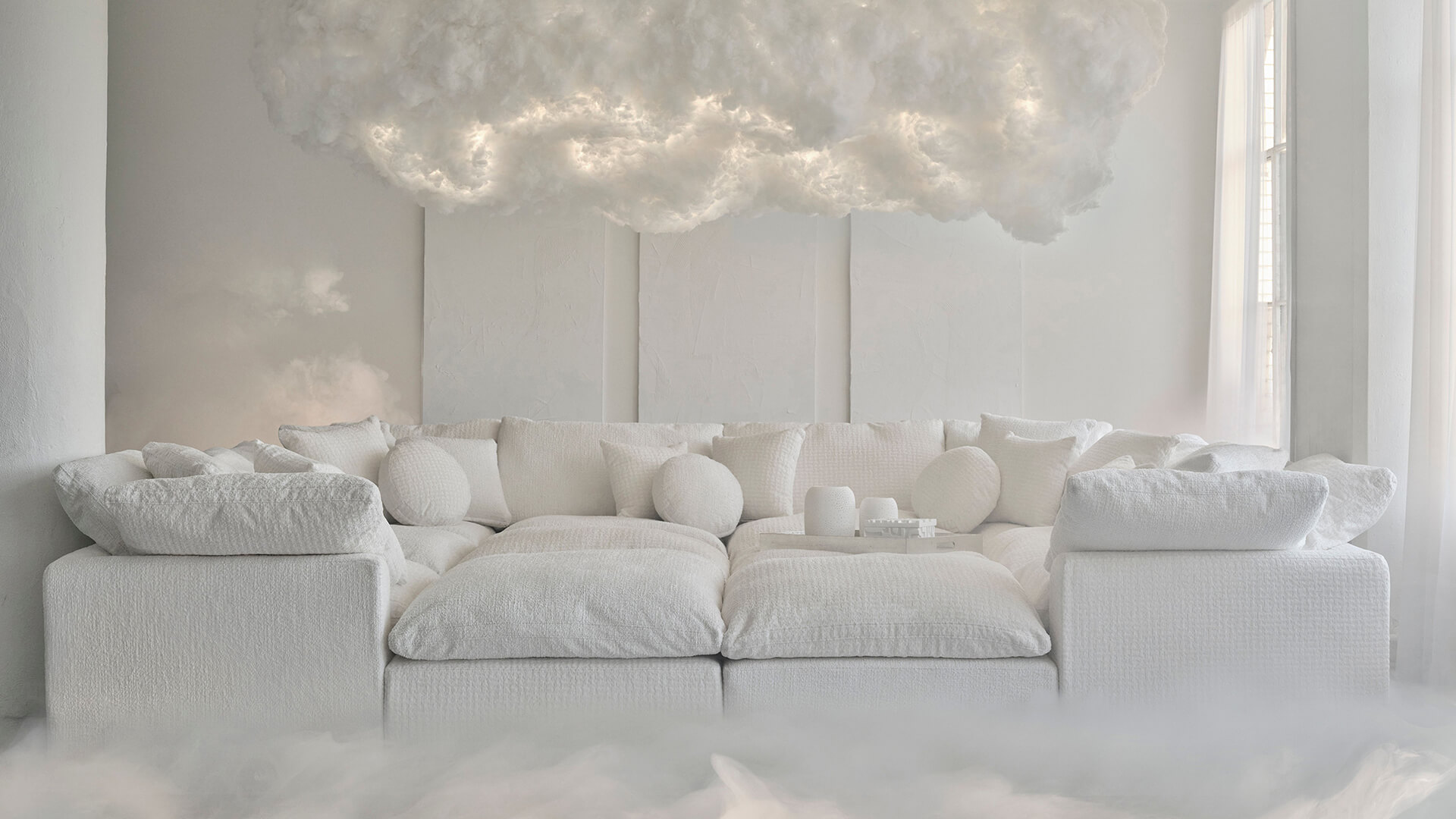
Cloud Dancer’s power lies in the psychology it invokes. This serene hue immediately registers as a source of lightness, well-being, and serenity. The task of strategic design is to translate these feelings from palette to pixel, ensuring that the user experience is felt as much as it is seen.
In design, this is achieved by creating a refuge for the user. We use abundant spaciousness, whether in architectural layout or digital whitespace, not as empty filler but as a purposeful element that reduces cognitive load and directs focus. This visual cleanliness and openness fosters a deep sense of calm, allowing the audience to navigate the space effortlessly. A calm, uncluttered experience removes friction and builds confidence in the quality and stability of the product or platform.

Cloud Dancer as Essential Structural Design
We can understand Cloud Dancer best by examining its function within a design system, not just its beauty.
The color is described as a key structural color and scaffolding for the spectrum. This means its primary role is not to dominate, but to provide a foundational stability that allows all other colors to shine. In design, this translates to systems that are built on clarity. The white space acts as the robust, non-negotiable anchor that ensures complex elements such as vibrant content, detailed data, or intricate user flows are amplified, not obscured. Cloud Dancer proves that the most powerful design elements are often the quietest, enabling function and feeling to intertwine at the foundation.
Nuanced Versatility in Design Application
Cloud Dancer’s strength is its unparalleled ability to harmonize. It is a discrete white that possesses an understated sophistication, demonstrating that elegance does not require complexity.
This versatility makes it a strategic powerhouse across various applications:
- The Art of Nuance: Cloud Dancer excels in strategic color harmonies, gracefully blending into veiled palettes like Light & Shadow to provide sophisticated contrast, or combining with Powdered Pastels for pleasing, understated shifts.
- The Minimalist Statement: In branding and multimedia, its use conveys a high-end, modern aesthetic. The classic combination of Cloud Dancer and black, the yin and yang, conveys sophistication and luxury, ensuring the product and brand quality remain the focal point.
It is a shade that supports rather than shouts, proving that the quietest elements often carry the most structural weight and visual distinction.

From Clarity to Confident Action
Cloud Dancer is more than the Color of the Year 2026, it is an invitation to embrace a purposeful future. It defines the journey from seeking quiet reflection in a chaotic world to establishing a structural anchor that enables confident, clear communication. It is the necessary space needed to simplify, focus, and finally give rise to our boldest visions.
This color is a commitment to clarity and confident execution. At Maples Design, we believe every bold mission deserves a foundation built with this level of structural integrity and focus. We are experts in translating the blank canvas of strategic vision into purposeful, robust digital platforms.
See it in action: Check out our M WOODS project, where we utilized this approach to create a calming, focused design.
We invite mission-driven organizations to partner with us to utilize this vision, turning Cloud Dancer’s promise into a platform that achieves full-stack excellence and client ownership.