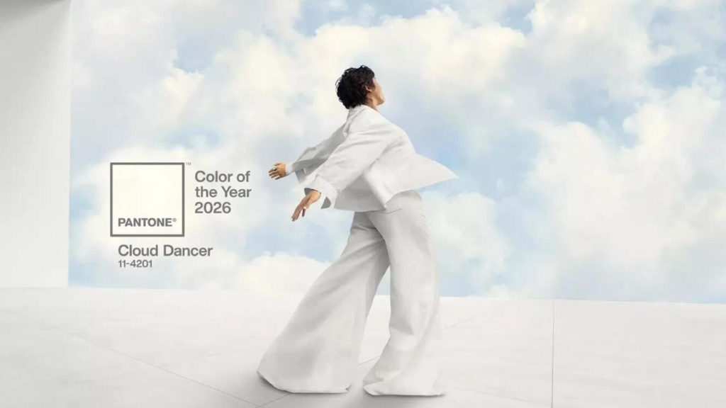
Ride the color current! Discover Pantone’s 2026 Color of the Year, Cloud Dancer.
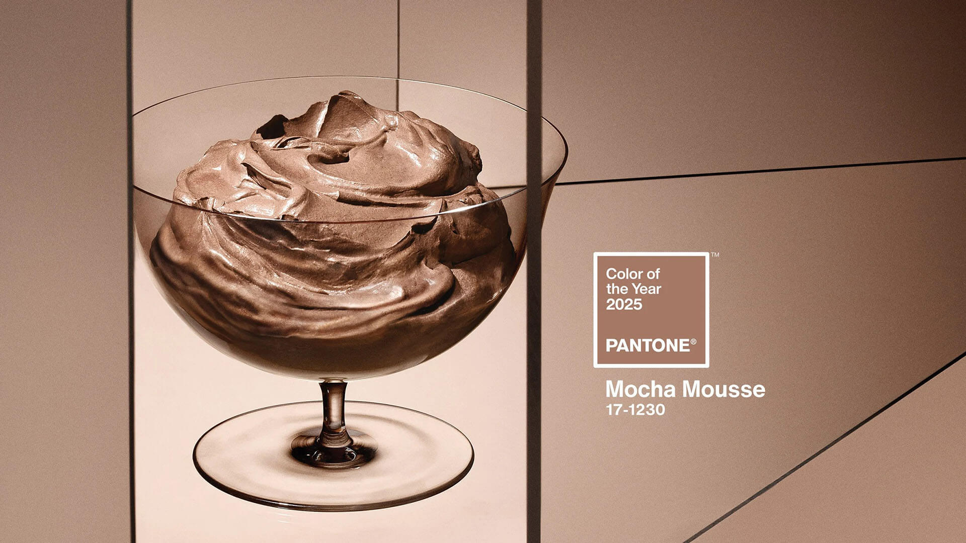
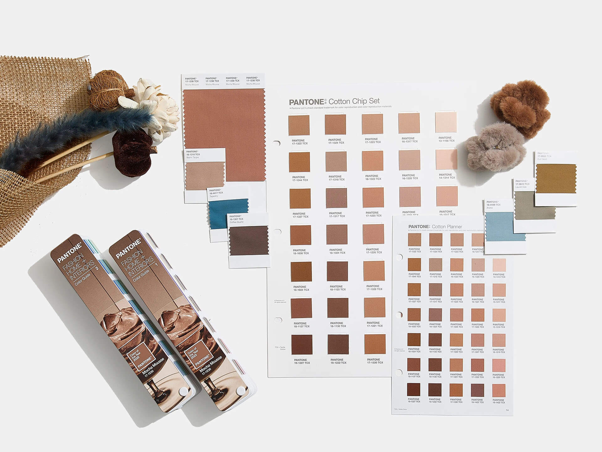
Every year, Pantone selects a Color of the Year that sets the tone for design trends across industries. For 2025, the Pantone Color Institute has chosen Mocha Mousse (PANTONE 17-1230), a warm and versatile hue that reflects a grounded, yet sophisticated aesthetic. This earthy brown captures a sense of stability and elegance, making it a standout choice for designers across various fields.
In this blog post, we’ll explore the aesthetics of Mocha Mousse, its psychological impact, practical design applications, and actionable tips for incorporating it into your projects.
The Aesthetics of Mocha Mousse
Mocha Mousse exudes timeless sophistication, blending the natural warmth of earth tones with an understated elegance that makes it a versatile choice for modern designs.
This shade offers:
- Natural Appeal: Drawing inspiration from organic materials like wood, leather, and soil, the color conveys a sense of groundedness and connection to nature.
- Subtle Luxury: Its muted tone evokes a sense of high-end refinement, making it ideal for designs that aim to feel upscale without being too loud.
- Versatility: Whether paired with neutrals for minimalist designs or with vibrant accents for contrast, Mocha Mousse adapts effortlessly to various aesthetics.
In the digital realm, this color can evoke a sense of comfort and trust, while its subdued richness ensures it remains visually striking yet easy on the eyes.
The Psychology Behind Mocha Mousse
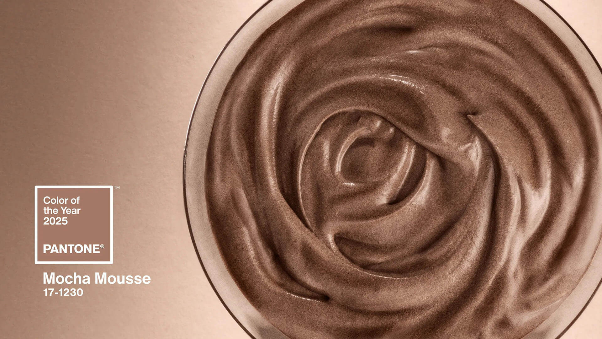
Mocha Mousse’s warm, neutral tone offers a calming and approachable aesthetic. This shade of brown evokes a sense of reliability and comfort, qualities that are crucial for enterprise brands looking to build trust with their audiences.
From a psychological perspective:
- Comfort and Warmth: Its natural tones create a calming atmosphere, ideal for brands aiming to foster a welcoming user experience.
- Elegance and Sophistication: Its muted richness conveys an understated luxury, appealing to high-end audiences and professional contexts.
- Trust and Stability: Neutral browns like Mocha Mousse suggest dependability, making it ideal for enterprise clients who want to convey a strong and reliable image.
For enterprise website design, these psychological attributes translate into a tone of trust and professionalism, enhancing the user experience while reinforcing brand identity.
Design Applications for Mocha Mousse
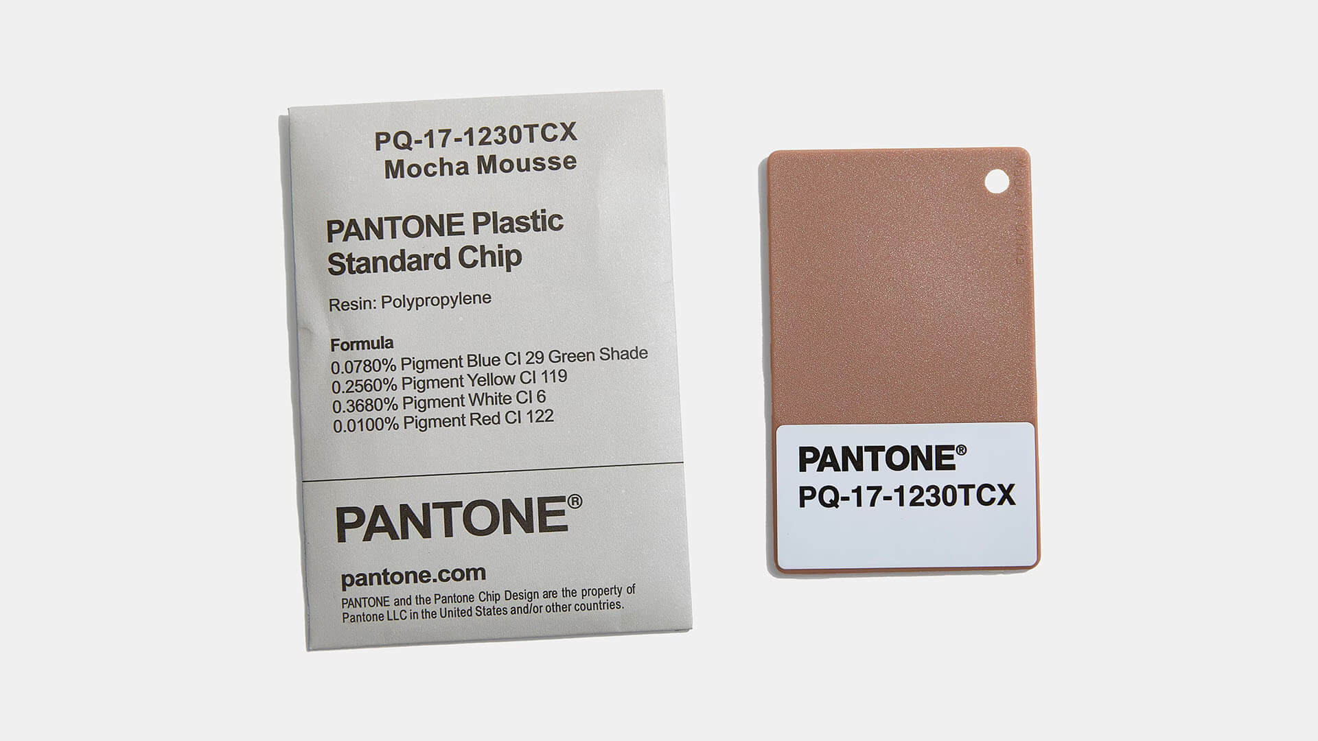
Mocha Mousse is a versatile hue for creating impactful design compositions. Here’s how it can be utilized effectively:
Website Design
- Backgrounds: Use the color as a subtle backdrop to make text and visuals stand out. Its neutral tone helps reduce visual noise while adding depth.
- Accent Colors: Apply the hue to buttons, icons, or headers where subtle emphasis is needed.
- Call-to-Action (CTA) Buttons: The warm tone draws attention to CTAs without feeling aggressive, encouraging users to engage.
Graphic Design
- Branding Materials: This shade pairs seamlessly with modern palettes, making it ideal for logos, brochures, and digital ads.
- Marketing Materials: Its richness enhances the appeal of brochures, social media graphics, and presentations, adding a polished touch.
UI/UX Design
- Balanced Aesthetics: Combine Mocha Mousse with neutral grays or soft blues from Pantone’s Subtle Contrasts palette for a harmonious interface.
- User-Friendly Interfaces: Its natural tone reduces visual fatigue, ensuring a more enjoyable user experience.
Pantone’s curated palettes, such as Relaxed Elegance and Floral Pathways, offer excellent inspiration for pairing Mocha Mousse with complementary shades, like taupe, cream, or willow green, to create rich, multidimensional designs.
Practical Tips for Using Mocha Mousse in Digital Design
Enterprise-Level Website Design
Start by incorporating the tone into your website’s key visual elements, such as backgrounds or hero sections, to create a welcoming and professional atmosphere. Then, enhance its effect by using it for subtle details like borders, hover effects, and menu icons, ensuring a consistent brand experience.
Pairing for Depth and Contrast
To avoid monotony, combine Mocha Mousse with contrasting colors. For example:
- Pair it with a vibrant teal or coral for a fresh, contemporary look.
- Use soft creams or grays for a minimalist, professional aesthetic.
This approach not only adds depth but also keeps the design visually engaging.
Multi-Device Consistency
When using the hue, ensure consistency across desktop and mobile designs. Test how the color looks on different devices and resolutions to maintain its warmth and richness.
A Grounded Vision for 2025
Mocha Mousse, Pantone’s 2025 Color of the Year, is more than just a design trend—it’s an opportunity to convey warmth, sophistication, and trust in your projects. Whether you’re creating a website, branding assets, or multimedia content, this versatile color offers endless possibilities for innovation and elegance.
