The furniture industry has grown rapidly in recent years. As the world’s largest furniture retailer IKEA continues to lead the industry by taking advantage of market trends. They are able to do this not only by championing the do-it-yourself side of affordable furniture and maintaining a huge real estate portfolio, but also by staying ahead of the curve with online sales and marketing. Other top brands in home furniture include La-Z-Boy, William-Sanoma, and Roche-bobois, to name a few. Steelcase and Brown Jordan pave the way for the office and outdoor industries, respectively.
In this article we will explore some of the website trends that allow these top furniture brands to keep users coming back to their sites for ideas and inspiration. This ultimately leads to more sales for the brand.
Getting inspired
Most people on furniture sites are browsing for ideas and concepts for their home, office, or interior design project. Whether they are an experienced architect searching for the right piece for their next project or a young consumer looking for a bargain piece, their purpose is to design something. Given this, the importance a good website design will have on their overall online shopping experience is large. High quality images, carefully considered fonts, and a complimenting color palette will go a long way to ensure the user is excited to browse the site and find what they are looking for.
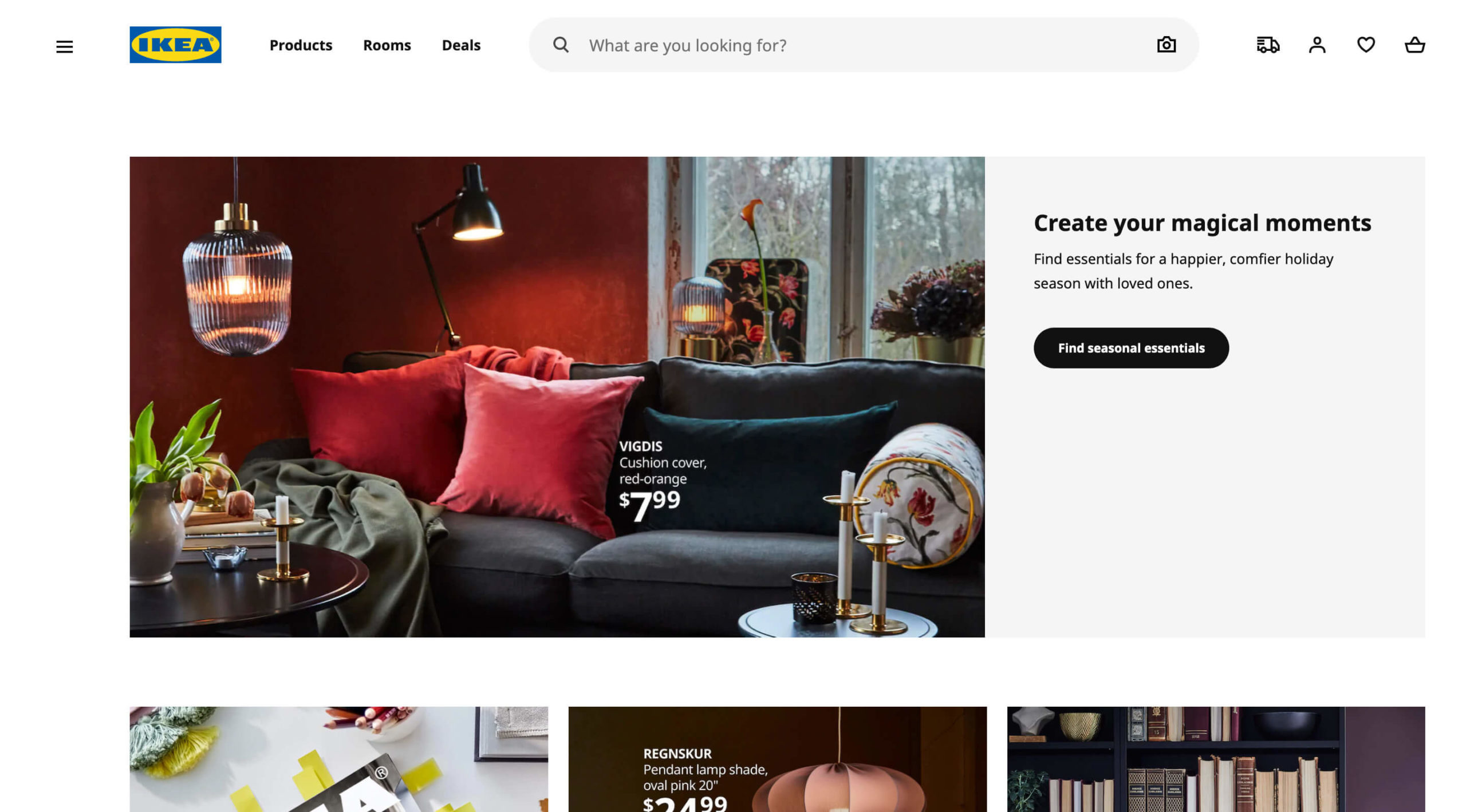
Up to 87 percent of customers do online research before they ever walk into a store, which means the website is a core pillar of every furniture brand’s marketing strategy. Furniture brands are in the business of making beautiful things, so they use their website to show off their designs. High quality images in creative settings keep users engaged and on their site. Even if they aren’t ready to buy, showcasing furniture in a well-designed setting will inspire and provide ideas. Up-to-date content goes hand-in-hand with the website design. Following the current work-from-home trend, Steelcase have a dedicated section for home office design ideas. Their content management team keeps this section updated with beautiful home office images, leading their users to get inspired and make a purchase!
Filtering the user journey
User flow is important to keep in mind. It is a good idea for furniture brands to maintain the traditional browsing and filtering methods that many buyers are already familiar with (category, room type, material). However, the standout sites offer different ways to assist the potential buyers in finding and choosing the products they want. Some points to consider are:
- Allow the potential buyers to navigate to the exact products they want as quickly as possible
- Upsell other products to the buyers by suggesting related products that fit their design
- Assist the buyers with visual hints to help them find the products they need even if they hadn’t thought of the exact items yet
By using different filtering methods and adapting to how users want to shop for furniture, users can be kept engaged with the brand. Here are a few unique methods that we’ve seen:
Filter by color
If you’ve picked a new green chair you really love for your living room and now you need a matching table, you don’t just pick a table of any style or color. You need a table that fits the look and feel of the chair you selected. Wouldn’t it be super cool to simply search and filter for all the tables that can go with your selected chair?
Filter by purpose
Often, people don’t just search for a single chair or table; they shop for an entire room. Other times, they may shop for a table, but a dining table, not a desk. In other words, what can help the buyers to find the products they want faster and easier is to group items into what are called “purpose groups”. Using these groupings, brands can provide a navigation and filtering system that fits this buying behavior.
Filter by concept
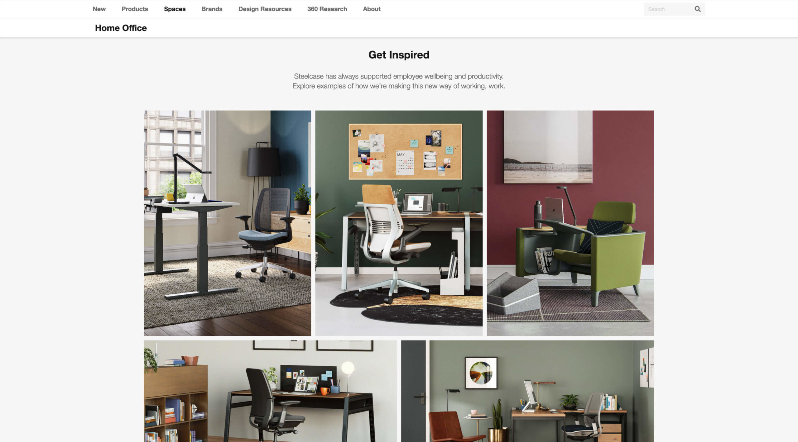
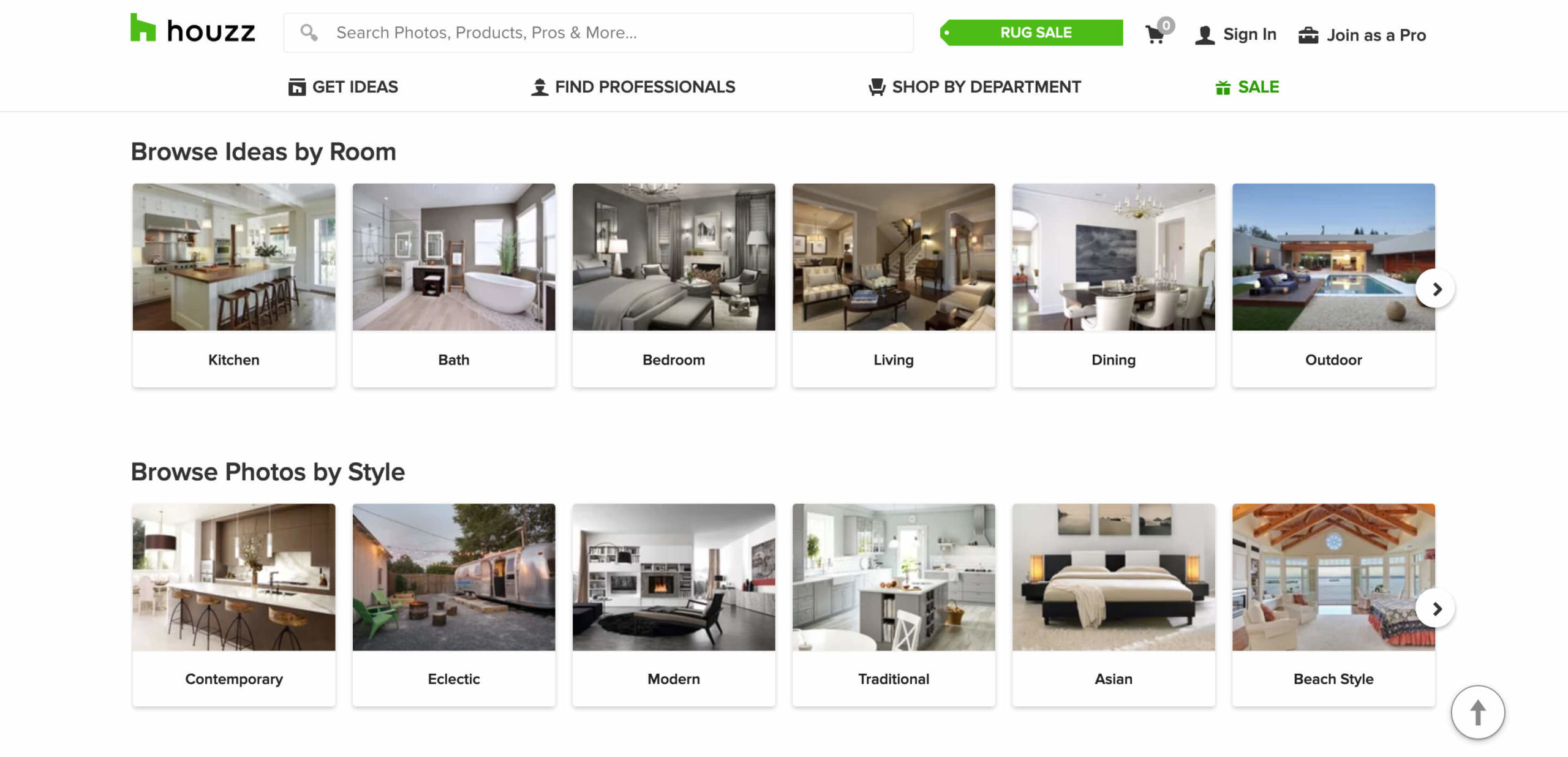
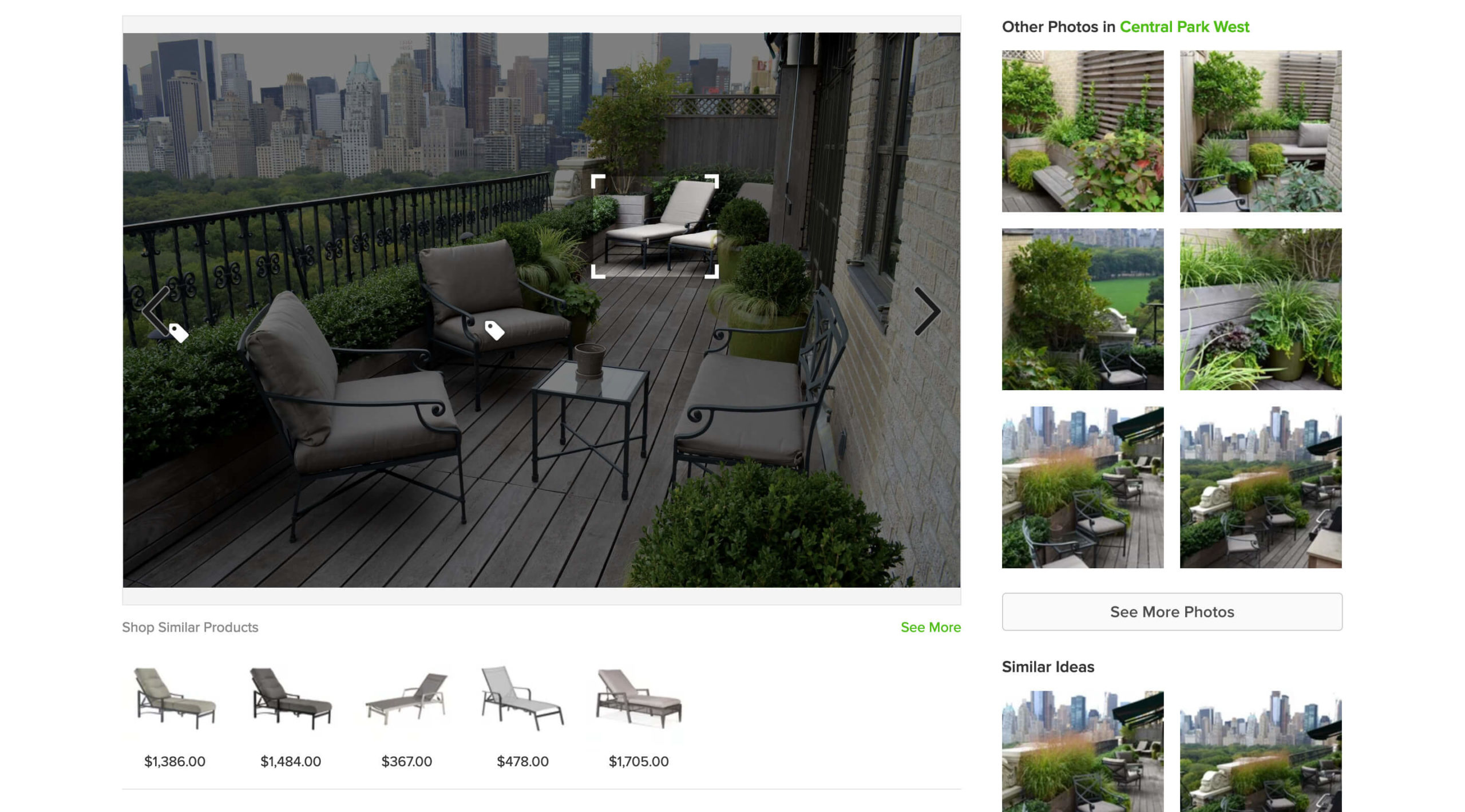
Experiences are a great way for users to interact with products and to see their ideas in action. IKEA does this the best at their huge retail malls. It is easy to step into one of their showrooms and feel the concept of the room and how each piece comes together. That shopping experience is great for buyers because it helps them to quickly get the feeling of whether they like it or not. Not many online furniture websites do that. Giving the shoppers the same experience offline can be difficult for many furniture retailers due to the lack of space. However, you have unlimited space online at a fraction of the cost. Houzz does a great job by offering the exact shopping experience of IKEA, but online. They offer a huge list of design photos (concepts) with all the furniture pieces neatly arranged. Once you find a concept you fall in love with, you can simply click on each item to check their price and related information.
From traffic to sales
Furniture websites are a great resource, both for professionals and non-professionals, looking to get inspiration for projects. Keeping users on your site (and coming back to your site) will ultimately lead to increased sales and growth. Once you have a customer’s interest, you need to keep it. Make sure your website is easy for customers to navigate, whether they want to browse for design inspiration, admire specific products, place an online order, or get directions to a local retail outlet. When you take on your next web design project be sure to consider user flow/journey, content quality, and loading times to ensure users are engaged with and staying on your site.
Are you thinking about updating your website’s design and user flow to stand out from the competition? We are always ready to chat about our ideas for ways to improve user experience.
