China is one of the fastest-growing countries in the world. Its demand for international schools is increasing just as rapidly. There are a variety of options of international schools with an outstanding reputation. Most are located in popular expat cities such as Beijing, Shanghai, and other provincial capitals like Guangzhou and Shenzhen.
According to Relocate magazine, the number of students studying at international schools in China is expected to grow from 475,000 in September 2017 to 881,000 in 2022. Expats and foreign students are looking for education opportunities to get into engaging classes in the most widely-spoken languages all over the world as well as with an international atmosphere. In other words, there is a need for international schools to differentiate themselves through marketing and branding in order to take advantage of the growing opportunities.
The importance of an education logo
When parents begin their research on educational institutions, a reputable brand image becomes a decisive factor on attracting them to a school. A strong logo helps build a professional image and serves as the first impression of the institution. Therefore, a thoughtful logo design is critical to a school’s marketing strategy. Top institutions will choose to hire professional designers in their pursuit of a great logo design that communicates their educational ideologies, defines their mission, and establishes trust while making their school stand out.
A good logo not only benefits the school’s marketing, but also engages the community. A Principal from Seattle’s Beason Hill School said after applying a new logo to their school:
Students are proud to be part of the school, parents are enthusiastically involved, and teachers are highly invested.
A school’s logo represents an identity. The choices of shapes, colors, and typefaces convey different meanings in logo design. Below we analyze six excellent education logos from some of the high-ranking international schools in China.
1. International School of Beijing

International School of Beijing (ISB) is an excellent school with a 40-years history. It was ranked as one of the top 10 international schools in 2017.
Shape: The shape of the logo is recreated from a Chinese word of nurturing (育, yù), which is highlighted in their commitment.
Our commitment to realizing students’ potential is built around nurturing the intellectual, physical, social and emotional development of each child.
The Chinese character component on top is designed in a shape of a child. It gives us a meaning that they take their students as the priority.
Color: The navy blue often symbolizes trust, confidence, and intelligence. It conveys their core values here as “global-mindedness, respect, service, integrity, balance, creativity.”
Typeface: The style is inspired by the Chinese calligraphy art, and it denotes the school’s history and its location in Beijing, the capital city of China.
2. Western Academy of Beijing
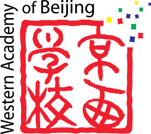
Western Academy of Beijing (WAB) was founded in 1994 as one of the top-ranking international schools in China. They defined their mission as “Connect, Inspire, Challenge: Make a difference”.
Shape: The outline of the square feels like a wall or a boundary, with an opening in the top right-hand corner. This thoughtful design is an emphasis on their mission in “Challenge”. It tells the audience that they both care about the academics and other teachings that extend beyond the classroom, like a special outdoor program called WAB Wild.
Color: Bright red, an emotional intense color that represents energy, passion, and joy. The little, colorful squares symbolize their students’ possibilities in the future.
Typeface: They chose the font in a Chinese pictographic character style that gives out a historical feeling, as well as a modern English sans-serif typeface on top. This combination is well-used to highlight their diverse environment with a respect to culture and global-mindedness.
3. Dulwich College
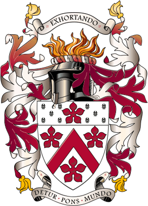
Dulwich College was originated from one of the oldest independent schools in UK, with nearly 400 years of history. They are well-known for their academic excellence and worldwide co-curricular programs. They have been opening international schools since 2003 and today have locations in over 60 countries. The logo design is based on their authentic roots and British values.
Shape: The shape of a badge is a distinct symbol that acknowledges their long heritage and celebrates British tradition.
Color: An elegant palette with deep red and silver. The red rose is recognized as the national flower of England.
Typeface: Traditional serif is often used in old-fashion designs, represents authority and reputation.
4. Western International School of Shanghai
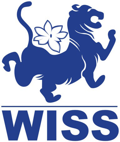
This popular institution was founded by three entrepreneurs from China and Taiwan. Compared to the previous school, Western International School of Shanghai (WISS) is relatively new and growing rapidly in recent years.
Shape: The image of a lion symbolizes the famous Chinese guardian lions and can be seen as the school’s mascot. The flower icon on the lion’s back is widely recognized as a metaphor for children and teenagers. The school’s logo communicates their mission of “[cultivating] young people”.
Color: It also uses the blue color to represent wisdom and their global-minded curriculum.
Typeface: A bold sans-serif font conveys a modern and solidified image of the school.
5. The British School of Guangzhou
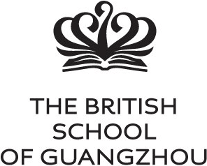
The British School of Guangzhou is a member of Nord Anglia Education group , a premium education provider with numerous international schools around the world. Their teaching philosophy is to “Be Ambitious” academically, socially, and personally.
Shape: The shape of a crown is based on the British Royalty symbol, and it has been redesigned here to include an opened book and a flower.
Color: Classic black and white stands for the school’s traditional teaching methods.
Typeface: A strong serif typeface for the title and name that is eye-catching and clear.
6. Shenzhen College of International Education
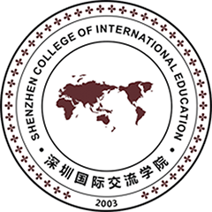
Shenzhen College of International Education (SCIE) is another leading international school founded in 2003 in Shenzhen and accredited by Cambridge International Examinations.
Shape: By looking at the world map in the middle of a classic circular shape, it aligns clearly with the school’s core objectives, which are “international-mindedness” and “cultural diversity.” This vision leads to the fact that most of their teachers are expatriates from all over the world, providing their students with a diverse learning atmosphere.
Color: The combination of brown and black often represents an official environment. It gives the parents and students an impression of reputation and the expectation to obtain an outstanding academic achievement.
Typeface: Black letters are differentiated from the shape and indicate who they are. Using all-caps also helps create a formal and trustworthy brand image.
Summing it up
An international school’s logo is the method that makes that institution recognizable. It translates a school’s values, history, and missions into an image and visually conveys the messages of who they are and what makes them different. A strong sense of identity helps a school stand out from the crowd. It could be a key factor that greatly impacts the reputation, community engagement, and business.
The logo is a tool to help communicate a school’s message in one easy-to-understand image. When was the last time you and your marketing team evaluated the message your logo is sending to potential parents and teachers? Maples Design is always ready to have a conversation with you about your branding and how it can be improved. If you are looking for assistance with a logo design or ways to strengthen your brand, our team is here to help.


