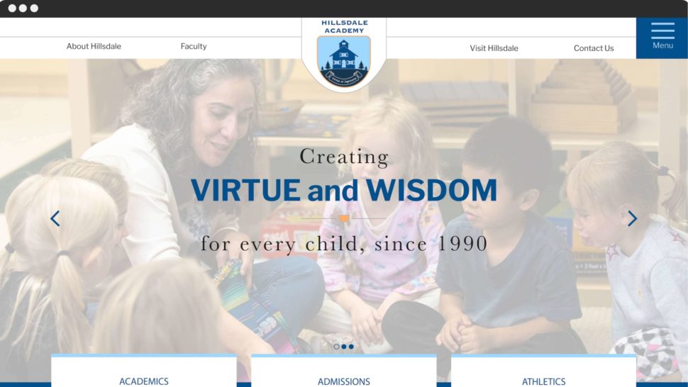
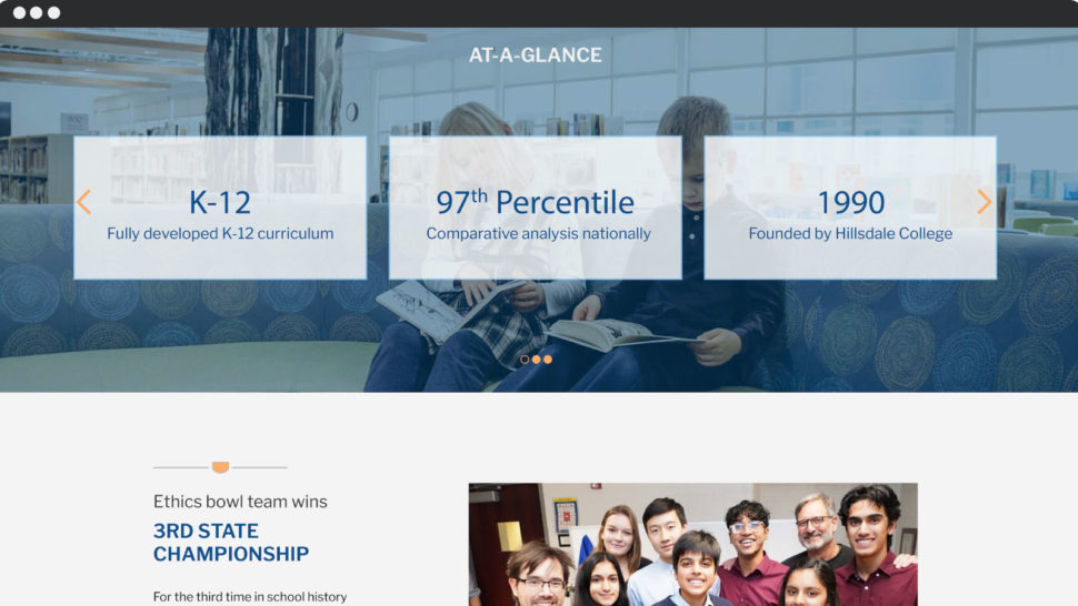
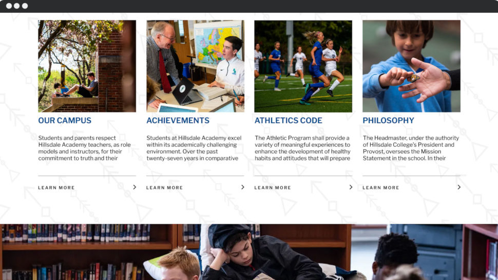
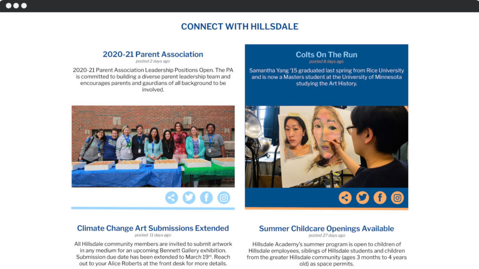
With competition for students on the rise, Hillsdale Academy was in need of a redesign to stay ahead of the curve. Using their strong legacy and established place in the market, Maples Design’s design exercise works to create a logo and website redesign to keep Hillsdale at the top of the private education industry.
Hillsdale Academy
Using Strength and History to Create Growth
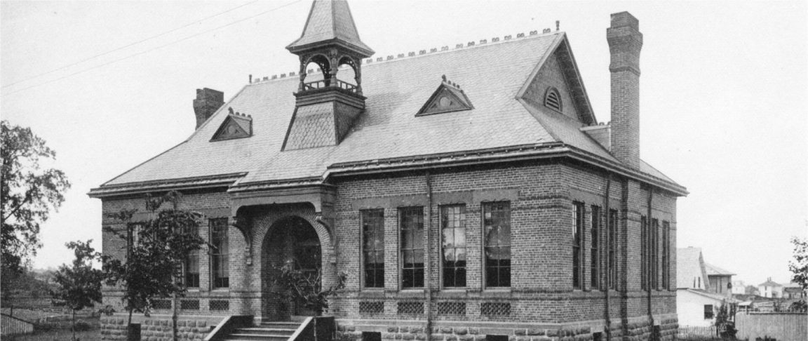
With almost 3 decades of storied history, Hillsdale Academy in Hillsdale, Michigan USA is known as one of the top K-12 private schools in the state. Our branding and website redesign started with a look at their logo. Their current logo has the old-style one-room schoolhouse which was built with the help of the local Native American tribe in Hillsdale in 1838. Its 20-year old logo gives the feeling of a small, closed community. With student numbers on the rise and competition from newer schools, Maples Design set out to update Hillsdale Academy’s logo for 2020 and beyond as well as redesign their website to maintain the feeling of history, strength, and status.
Design with Purpose for Hillsdale
Virtus et Sapientia (Virtue and Wisdom) is Hillsdale Academy’s motto. For this website update, our design team began with the newly designed logo. Keeping the colors of navy, light blue, and white, we added accents with burnt orange and grey to allow our design team more flexibility in the look and feel. Blue is most often associated with depth and stability, and we used this color tone to create clean block shapes to give the feeling of strength and foundation.
Next, the main user profiles of Academics, Admissions, and Athletics were defined. These line up with Hillsdale Academy’s goals of highlighting Achievement, Growth, and Student Life, mapping paths to prioritize the layout and options for users coming to the website. Arranging the site this way quickly allows users to get to the relevant information and creates a happier experience while on Hillsdale Academy’s site.

User Flow for Education
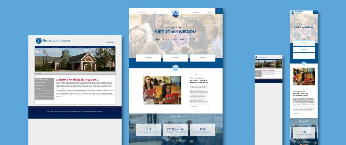
With a strong homepage to give all users quick access to the content they need, the next step was to answer why they landed on the site. With growth as a leading goal for this project, ”Exploring Hillsdale” walks the user through a select group of blocks where they can dive deeper and learn more. Our Maples development team creates secondary pages for the Hillsdale mission statement, at-a-glance, recent highlights or achievements, the Hillsdale student experience, and social media sections, all in a beautifully designed interface.
In 2020 a responsive website is a must. Users access the site from many different devices. In addition to a flexible and customized content management system, at Maples we always design our sites to be mobile-first. This means that the website will look great on any device.
Creating the Foundation for Growth
Continuing a legacy and changing to meet current trends and reach future goals, our redesign exercise of the Hillsdale Academy logo and website offers a chance for further growth. The new user sections allow people to quickly access what they are looking for with fewer clicks and our development and admin tools are easy to use and understand. Hillsdale Academy has already built a strong name and history through quality education and always putting their students first. We believe Hillsdale Academy will continue to grow and push the lines of what a first-class private school education can offer.
Would you like to learn more about how the Maples Design team can help with your logo or website redesign? We’d love to hear what your goals are and how we can help you reach them.
